Version 6 of ttk::checkbutton as toggle switch display
Updated 2016-05-03 05:17:04 by bllcheckButtonToggle
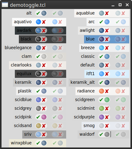
bll 2016-4-26. This code provides an alternative styling of ttk::checkbutton as a toggle switch. This style of switch is becoming more common in user interfaces. There are currently 7 different switch styles in order to support the 22 different ttk themes. The package will select a toggle switch style upon load, and a bind to <<ThemeChanged>> sets it when the theme is changed.
The user can set any of the styles as a default and can use multiple styles.
bll 2016-5-2. I have updated the package to include multiple sizes of images and depending on the tk scaling value, it changes which set of images gets displayed. No idea if I got the scaling quite right, but a quick test looks ok.
Tk really needs SVG widgets.
Discussion
aspect 2016-04-28: beautiful widget and a very nice example of how to do custom layout with ttk. One question - is there any particular reason you excluded Checkbutton.focus from the layout? I much prefer having it to aid keyboard navigation & accessibility. Adding it back as a parent of the new indicator element seems to work, but I've only tested very roughly with the provided demo.
bll 2016-4-27: I copied a layout from another theme. Sorry, did not check the original. I have updated the code below to match the default ttk::checkbutton.
Code
checkButtonToggle demo code
#!/usr/bin/env tclsh

package require Tk
if { [catch {package require checkButtonToggle}] } {
  source ../../modules/checkButtonToggle/checkButtonToggle.tcl
}

proc dodisable { c } {
  variable vars

  if { $vars(disabled.$c) } {
    .cb$c state disabled
  } else {
    .cb$c state !disabled
  }
}

proc setDisplay { c } {
  set vars(onoff.$c) 0
  set vars(disabled.$c) 0

  ttk::label .l$c \
      -text $c

  ttk::checkbutton .cb$c \
      -variable vars(onoff.$c) \
      -text {} \
      -style $c.Toggle.TCheckbutton

  ttk::checkbutton .dis$c \
      -variable vars(disabled.$c) \
      -text Disable \
      -command [list dodisable $c]
  grid .l$c .cb$c .dis$c -padx 3p -pady 1p
  grid configure .l$c -sticky e
}

proc demo { } {
  variable vars

  set styles [checkButtonToggle::styles]
  set rc [checkButtonToggle::init {*}$styles]

  foreach {c} $styles {
    setDisplay $c
  }

  foreach {c} [lsort [ttk::style theme names]] {
    setDisplay $c
  }
}

demo
bll 2016-5-2: Due to the size of the package, I have made the code available for download. The checkButtonToggle package can be downloaded from:
http://gentoo.com/tcl/checkButtonToggle.tcl%|%http://gentoo.com/tcl/checkButtonToggle.tcl%|%